


Update: 2026 Interior Color Trends Leading Design
Color always plays an important role in shaping the style and emotion of living spaces. Among these, 2026 interior design color trends are leaning towards a balance between nature and modernity. This article will help you update on the latest color palettes and effective application methods.

▲Table of Contents
1. Overall perspective on interior colors in 2026
1.1. The transformation of color trends through each phase
In recent years, interior color palettes have shifted significantly from bright, bold colors to soft neutral tones, aiming to create a comfortable feeling and suit modern living spaces. This change reflects the need for balance between aesthetics and emotion, as users prioritize stability and relaxation in daily life.
This shift reflects the need to balance aesthetics and emotions, as users prioritize stability and relaxation. Specifically, the current application of colors must comply with material standards in the Housing Law 2023 (Number 27/2023/QH15), encouraging shades from recycled and environmentally friendly materials, creating a living space that is both modern and sustainable.
1.2. The importance of color for living spaces
Color plays an important role in shaping user psychology. However, the choice of color palette is not just about aesthetics but must also comply with QCVN 06:2024/BXD on fire safety. Paints, wallpaper, or colored surface materials need certification on fire resistance limits and smoke generation, especially in evacuation areas or high-rise apartments.
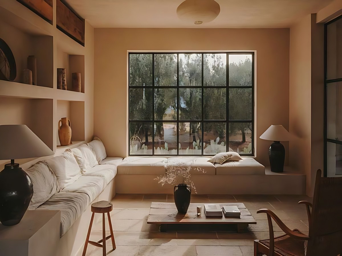
Interior colors affect emotions and the overall aesthetic of living spaces. (Source: Collected)
Besides emotional factors, color also contributes to the overall aesthetic of a space through the coordination of color palettes and materials. A reasonable color palette will help increase connectivity and create harmony between functional areas. This is especially important in the context of modern design when spaces are increasingly optimized and multifunctional.
1.3. Trends shaping interior color palettes in 2026
The current color palette leans towards balance, with neutral and natural tones playing a dominant role. These color tones create a stable foundation, are easy to coordinate, and optimize lighting. This greatly aids in implementing energy-saving standards in residential buildings, making spaces harmonious and flexible in response to climate changes.
Additionally, the 2026 trend also shows a combination of modern and natural elements through the coordination of colors with materials such as wood, stone, or metal. This interplay helps create living spaces that are both comfortable and close to nature. This is a development direction that suits the current needs for sustainable and personalized living in interior design.
2. Dominant color palettes leading the 2026 design
2.1. Warm neutral tones take center stage
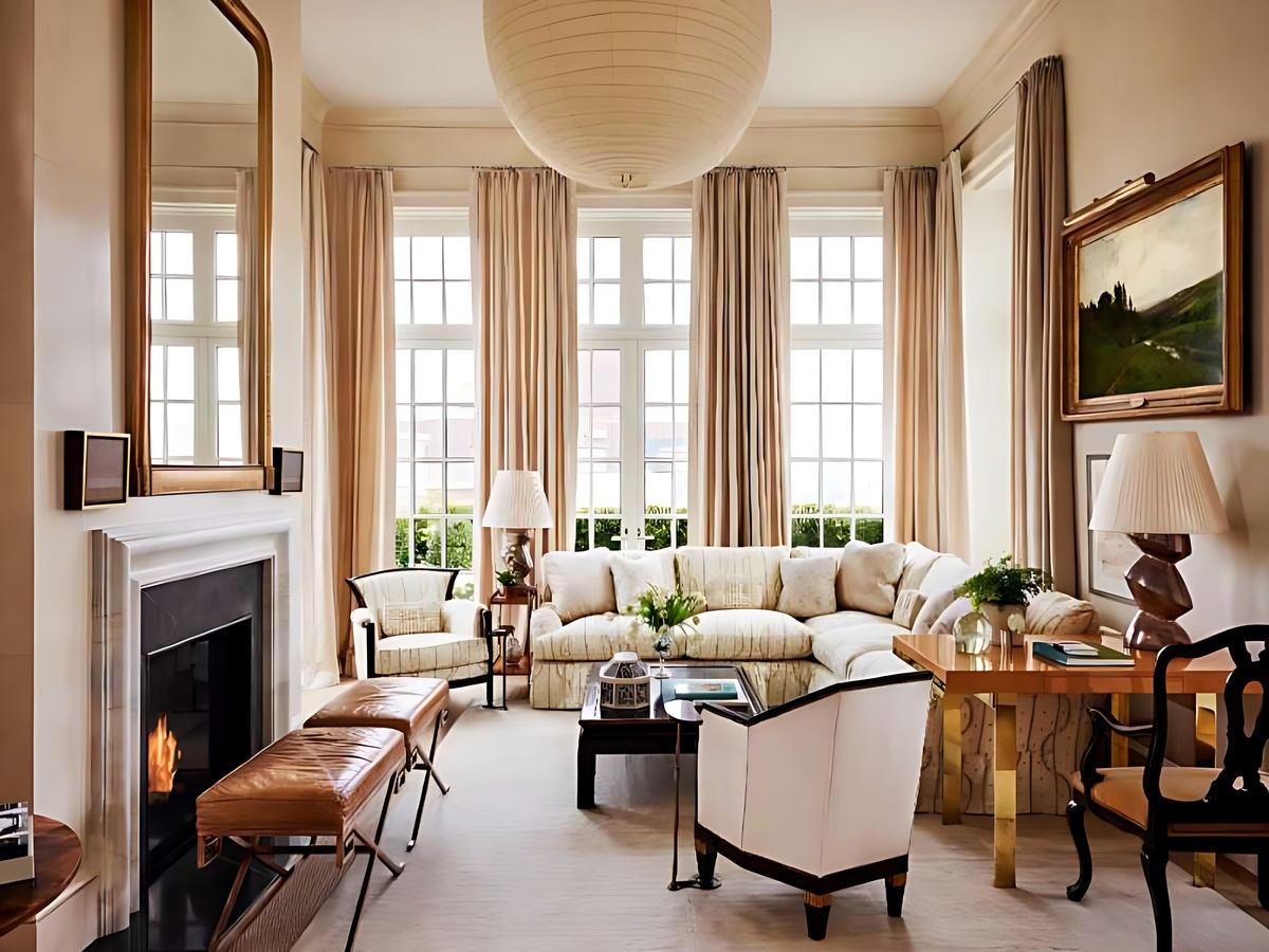
Warm neutral tones such as beige, cream, and light brown are becoming popular choices in interior design for their ability to create a cozy and comfortable feeling. These colors help spaces feel softer compared to previous cool tones. This contributes to reinforcing the position of interior design color trends 2026 towards warmth and balance.
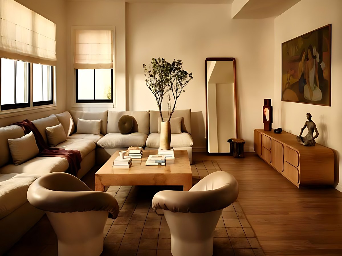
Warm neutral tones create a pleasant and harmonious feeling for the space. (Source: Collected)
Besides, warm neutral colors also have the ability to coordinate flexibly with many different types of materials and design styles. The use of these color palettes helps create a stable foundation for the space and easily combine with other color accents. Thus, the living space becomes harmonious and suitable for many usage needs.
2.2. Natural and green colors
Shades of green like moss green or olive green maintain their position thanks to their ability to bring relaxation. These are also common tones found in materials with green certifications (Green Mark), helping homeowners express their personal style while ensuring the house meets green building standards strongly promoted by the Ministry of Construction.
Besides aesthetic factors, green also has a positive impact on psychology by helping to reduce stress and increase feelings of stability. The combination of green with natural materials like wood or stone enhances visual effects and spatial experience. This is a suitable choice for areas like the living room or bedroom.
2.3. Accent colors for personality
Bold color palettes such as earthy orange or wine red are used as accents to give the space depth and personality. The distribution of these strong shades requires subtlety so as not to affect the natural light in the room, ensuring visual comfort according to current housing design standards.
Accent colors not only create prominence but also help balance the overall when combined with neutral background colors. The choice of suitable colors should be based on the area and lighting of the space to avoid creating a heavy feeling. This helps ensure aesthetic appeal and long-term usability.
2.4. Trend of subtle contrasting color schemes
The trend of subtle contrasting color schemes focuses on combining light and dark color palettes to create visual balance in the space. This scheme adds depth while maintaining overall harmony. This is one of the prominent features of interior color trends 2026 .
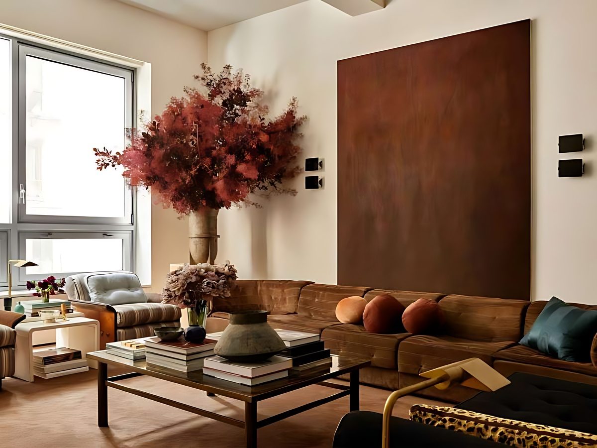
Subtle contrasting color scheme creates depth and visual balance for the space. (Source: Collected)
The use of subtle contrast makes the space lively without causing too strong an opposing feeling. This combination is often applied in modern styles to create a subtle visual effect. Thanks to this, the living space has both a focal point and maintains balance.
3. Principles of interior color coordination according to new trends
3.1. Basic color coordination rules to grasp
The 60-30-10 rule remains the guiding principle for creating color balance. The dominant color occupies most of the area, the secondary color supports it, and the accent color creates emphasis. Adhering to this ratio helps the space be cohesive, easily control the total amount of materials used, thereby better controlling safety emission indicators according to new environmental regulations.
Proper color distribution helps increase visual effectiveness and avoid visual clutter in design. This is especially important when using many colors in the same space. Adhering to color matching principles helps ensure consistency and easy adjustments when needed.
3.2. Color Combination by Interior Style
Color coordination according to interior styles such as minimal or contemporary helps to clearly define the personality of the living space. Neutral colors are often preferred in minimalist styles, while modern styles can incorporate accent colors. This helps interior colors trend 2026 to suit various design directions.
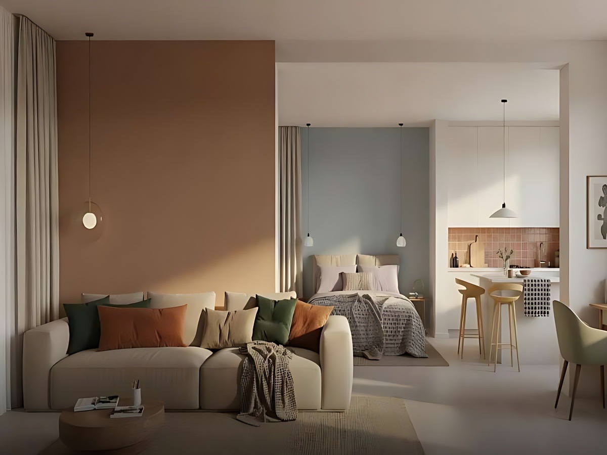
Combining colors in style helps living spaces harmonize and synchronize. (Source: Collected)
Besides, the natural style often uses earthy and green tones to create a sense of closeness and relaxation. This combination helps the space become more harmonious and comfortable during use. Choosing colors according to style helps increase synchronization and aesthetic efficiency.
3.3. Notes when choosing colors for each space
Color selection needs to be suitable for the function of each space to ensure usability and user emotions. Living rooms usually prioritize bright and harmonious colors to create a spacious and friendly feeling. In that context, 2026 interior color trends need to be flexibly adjusted for each area.
For bedrooms, soft colors such as beige, light blue, or pastel are used to create a relaxing feeling and support sleep. Choosing the right colors helps improve rest quality and reduce stress. This shows the important role of color in shaping the living space experience.
4. Implementation of the 2026 trend color palette into real living spaces
4.1. Defining dominant colors for common living areas
The living room is the central area, so the use of colors needs to ensure harmony and create suitable accents for the overall space. Details such as sofas, walls, or carpets can be used to create color accents. The application of 2026 trend interior colors makes the space more modern and comfortable.
In addition, the combination of natural light enhances the effectiveness of colors and creates a sense of spaciousness for the area. Light plays an important role in highlighting colors and increasing visual depth. The combination of color and light enhances the user experience of the space.
4.2. Creating relaxing tones for bedrooms and personal spaces
Bedrooms and private spaces often favor neutral and pastel colors to create a sense of relaxation and stability. These colors help reduce stress and support effective rest. The application of 2026 interior color trends in this area needs to focus on emotional factors.
Neutral and pastel colors create a private, relaxing, and quiet space. (Source: Collected)
Private spaces can also incorporate light color details to create accents without losing tranquility. Choosing the right colors helps increase personalization and improve living experience. This is an important factor in modern interior design.
4.3. Points to Consider When Applying Trend Colors in Practical Use
Applying trend colors requires avoiding the overuse of too many hues in the same space to ensure overall harmony. The balance between background colors and accent colors helps the space become pleasant and not visually jarring. This is especially important when using trend interior colors 2026 in practical design.
Additionally, it is necessary to ensure synchronization between areas in the apartment to create connection and unity in design. The choice of colors should be based on lighting, area, and the overall style of the space. This helps ensure aesthetic effectiveness and long-term applicability.
Choosing the right 2026 trending interior colors will help you create a harmonious, modern, and emotionally rich living space. Applying flexibly according to needs and actual area will help the house be both beautiful and conveniently long-lasting. We wish you the best in choosing the most suitable color palette.